Forecasting Uncertainty: Why Prediction Intervals Matter

A practical introduction to prediction intervals using a Bayesian trend-seasonal model on the classic AirPassengers dataset.

bayesian modeling
forecasting
uncertainty
time series
Author

AJ Jhones Lacubtan

Published

May 21, 2026

Most forecasts are presented as a single number.

That is convenient, but it is rarely enough for decision-making. If a model says next month’s demand will be 450, the immediate follow-up should be: 450 with how much uncertainty?

A forecast of 450 with a plausible range of 440 to 460 leads to a very different decision than a forecast of 450 with a plausible range of 300 to 600. The point forecast is the same. The risk is not.

This is where prediction intervals matter.

In this post, we will use a Bayesian forecasting model on the classic AirPassengers dataset. The goal is not to build the most advanced time-series model. The goal is to show how model structure and posterior predictive uncertainty work together.

Dataset

The AirPassengers dataset contains monthly totals of international airline passengers from 1949 to 1960. It is a standard time-series example because the structure is visible even before fitting a model.

There are three important features:

  • Upward trend: passenger volume increases over time.
  • Annual seasonality: peaks and troughs repeat every 12 months.
  • Increasing seasonal amplitude: the gap between seasonal highs and lows grows as the series level increases.

That last point matters. A raw-scale additive model would assume that seasonal swings have roughly constant size. Here, the seasonal swings are larger when passenger volume is larger. A log transformation is a simple way to make that structure easier to model: multiplicative seasonality on the original scale becomes approximately additive on the log scale.

Code
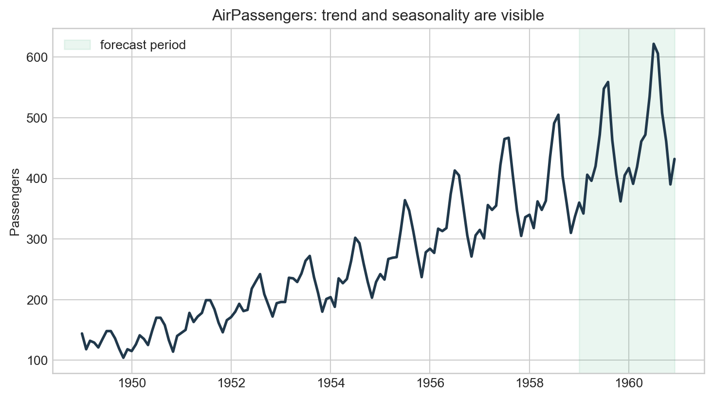
# Embed the classic AirPassengers series so the article is self-contained.
air_passengers = [
    144, 118, 132, 129, 121, 135, 148, 148, 136, 119, 104, 118,
    115, 126, 141, 135, 125, 149, 170, 170, 158, 133, 114, 140,
    145, 150, 178, 163, 172, 178, 199, 199, 184, 162, 146, 166,
    171, 180, 193, 181, 183, 218, 230, 242, 209, 191, 172, 194,
    196, 196, 236, 235, 229, 243, 264, 272, 237, 211, 180, 201,
    204, 188, 235, 227, 234, 264, 302, 293, 259, 229, 203, 229,
    242, 233, 267, 269, 270, 315, 364, 347, 312, 274, 237, 278,
    284, 277, 317, 313, 318, 374, 413, 405, 355, 306, 271, 306,
    315, 301, 356, 348, 355, 422, 465, 467, 404, 347, 305, 336,
    340, 318, 362, 348, 363, 435, 491, 505, 404, 359, 310, 337,
    360, 342, 406, 396, 420, 472, 548, 559, 463, 407, 362, 405,
    417, 391, 419, 461, 472, 535, 622, 606, 508, 461, 390, 432,
]

df = pd.DataFrame({
    "date": pd.date_range("1949-01-01", periods=len(air_passengers), freq="MS"),
    "passengers": air_passengers,
})

# The log scale turns multiplicative growth and seasonality into an additive model.
df["log_passengers"] = np.log(df["passengers"])
df["t"] = np.arange(len(df))
df["month"] = df["date"].dt.month - 1

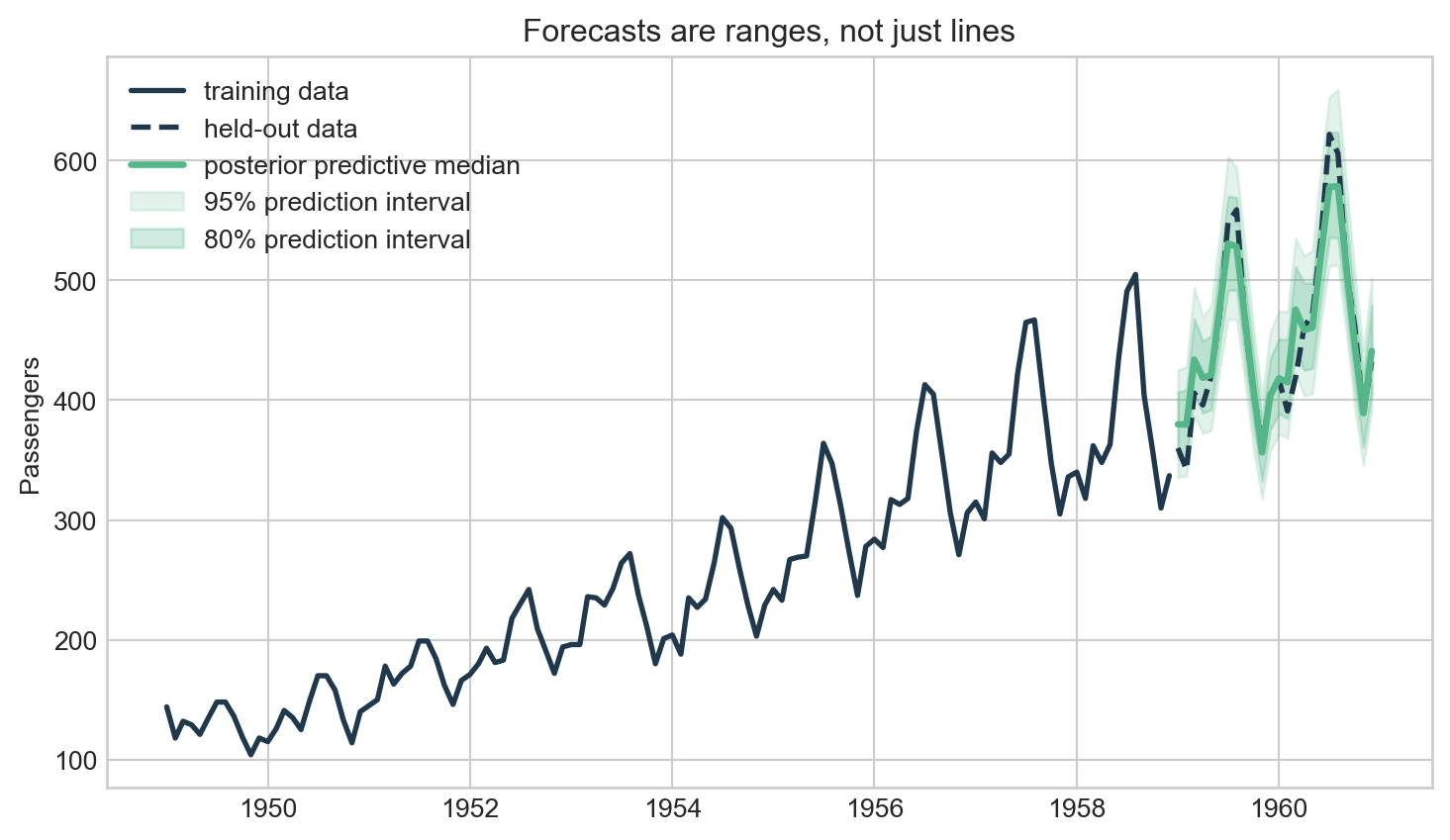
# Hold out the final 24 months so interval coverage can be checked honestly.
train = df.iloc[:-24].copy()
test = df.iloc[-24:].copy()
Code
fig, ax = plt.subplots(figsize=(9, 4.8))
ax.plot(df["date"], df["passengers"], color="#20384b", linewidth=2)

# Shade the period excluded from fitting and later used for forecast evaluation.
ax.axvspan(test["date"].min(), test["date"].max(), color="#54b689", alpha=0.12, label="forecast period")
ax.set(title="AirPassengers: trend and seasonality are visible", xlabel="", ylabel="Passengers")
ax.legend(frameon=False)
plt.show()

Monthly international airline passengers, 1949-1960.

Why not just use a point forecast?

A point forecast summarizes the center of a predictive distribution. It answers a narrow question:

What value does the model expect?

A prediction interval answers a more useful question:

What future values are plausible, given what the model knows and does not know?

For planning, the second question is usually more important. Staffing, inventory, capacity, risk limits, and energy planning all depend on the range of possible outcomes, not only the average expected outcome.

A Bayesian forecasting model

The plot suggests a baseline model with two main components: a long-run trend and a repeating monthly seasonal pattern. Because the seasonal amplitude increases with the level of the series, we model the logarithm of passenger counts rather than the raw counts.

The model is still compact, but each part is motivated by the data:

\[ y_t \sim \text{StudentT}(\nu, \mu_t, \sigma) \]

\[ \mu_t = \alpha + \beta_1 t + \beta_2 t^2 + \gamma_{\text{month}[t]} \]

where:

  • \(\alpha\) is the baseline level.
  • \(\beta_1\) is the main trend.
  • \(\beta_2\) allows the growth rate to bend instead of forcing a straight-line extrapolation.
  • \(\gamma_{\text{month}}\) captures monthly seasonality.
  • \(\sigma\) captures residual scale.
  • \(\nu\) controls the tail thickness of the Student-t likelihood.

On the original passenger scale, this corresponds to a multiplicative trend-seasonal structure. On the log scale, it becomes an additive regression model that is easier to estimate and explain.

This model is Bayesian for a specific reason: every unknown quantity is represented as a probability distribution. Forecasts are generated from the posterior predictive distribution, so uncertainty is not added after the fact. It is part of the model output.

One detail matters for the seasonal terms: the monthly effects should be identifiable. If every month effect can shift upward together, the intercept and seasonality compete with each other. To avoid that, we use a zero-sum prior for the monthly effects, meaning the 12 seasonal deviations are constrained to sum to zero.

This is still a baseline model. It assumes a smooth quadratic trend on the log scale and stable month effects over time. Those assumptions are useful for a first pass, but they are also why we should check calibration rather than assume the prediction intervals are reliable.

We also use a Student-t likelihood instead of a Normal likelihood. The Normal likelihood has thin tails, which can make a model too confident when some months deviate more than expected. A Student-t likelihood is still centered around the same mean structure, but it allows occasional larger residuals.

Code
# Standardize time so trend priors are stable and easier for MCMC to sample.
t_mean = train["t"].mean()
t_sd = train["t"].std()
t_train = ((train["t"] - t_mean) / t_sd).to_numpy()
t_train_sq = t_train ** 2
y_train = train["log_passengers"].to_numpy()
month_train = train["month"].to_numpy()

coords = {"month": np.arange(12)}

with pm.Model(coords=coords) as model:
    alpha = pm.Normal("alpha", mu=y_train.mean(), sigma=1.0)
    beta = pm.Normal("beta", mu=0, sigma=1.0)

    # Quadratic trend allows growth to bend instead of extrapolating a straight line.
    beta2 = pm.Normal("beta2", mu=0, sigma=0.3)

    # Zero-sum month effects keep seasonality identifiable against the intercept.
    month_effect = pm.ZeroSumNormal("month_effect", sigma=0.35, dims="month")
    sigma = pm.Exponential("sigma", lam=2.0)

    # Student-t degrees of freedom are constrained above 2 for finite variance.
    nu = pm.Exponential("nu_minus_two", lam=1 / 10) + 2

    mu = alpha + beta * t_train + beta2 * t_train_sq + month_effect[month_train]

    # Student-t likelihood is less overconfident when months deviate unusually.
    pm.StudentT("y", nu=nu, mu=mu, sigma=sigma, observed=y_train)

    # Sampling is modest for website rendering; increase draws/chains for production work.
    idata = pm.sample(
        draws=800,
        tune=800,
        chains=2,
        target_accept=0.9,
        random_seed=42,
        progressbar=False,
    )
Code
az.summary(idata, var_names=["alpha", "beta", "beta2", "sigma", "nu_minus_two"], round_to=3)
mean sd hdi_3% hdi_97% mcse_mean mcse_sd ess_bulk ess_tail r_hat
alpha 5.457 0.007 5.445 5.470 0.000 0.000 1387.670 1386.925 1.002
beta 0.371 0.005 0.361 0.380 0.000 0.000 2088.562 1082.410 1.001
beta2 -0.027 0.006 -0.038 -0.016 0.000 0.000 1317.182 1436.494 1.000
sigma 0.046 0.005 0.037 0.054 0.000 0.000 1232.102 1105.521 1.002
nu_minus_two 5.719 3.989 0.404 12.604 0.097 0.071 1584.695 1223.541 1.000

Posterior predictive forecasting

The posterior distribution gives us plausible values for the model parameters. To forecast, we repeatedly:

  1. Draw plausible parameters from the posterior.
  2. Compute the expected future value.
  3. Add future observation noise.

The resulting samples are draws from the posterior predictive distribution. The prediction intervals below are just quantiles of those simulated future values.

Code
# Collapse chains and draws into one posterior sample axis for vectorized forecasting.
posterior = idata.posterior.stack(sample=("chain", "draw"))

alpha_draws = posterior["alpha"].values
beta_draws = posterior["beta"].values
beta2_draws = posterior["beta2"].values
sigma_draws = posterior["sigma"].values
nu_draws = posterior["nu_minus_two"].values + 2
month_effect_draws = posterior["month_effect"].values

t_test = ((test["t"] - t_mean) / t_sd).to_numpy()
t_test_sq = t_test ** 2
month_test = test["month"].to_numpy()

# Compute the posterior distribution of the future conditional mean on the log scale.
mu_test = (
    alpha_draws[:, None]
    + beta_draws[:, None] * t_test[None, :]
    + beta2_draws[:, None] * t_test_sq[None, :]
    + month_effect_draws[month_test, :].T
)

# Add future observation noise to get posterior predictive draws, not just mean draws.
y_pred_log = mu_test + sigma_draws[:, None] * rng.standard_t(df=nu_draws[:, None], size=mu_test.shape)
y_pred = np.exp(y_pred_log)

forecast = test[["date", "passengers"]].copy()

# Prediction intervals are empirical quantiles of posterior predictive samples.
forecast["median"] = np.quantile(y_pred, 0.50, axis=0)
forecast["lower_80"] = np.quantile(y_pred, 0.10, axis=0)
forecast["upper_80"] = np.quantile(y_pred, 0.90, axis=0)
forecast["lower_95"] = np.quantile(y_pred, 0.025, axis=0)
forecast["upper_95"] = np.quantile(y_pred, 0.975, axis=0)
Code
fig, ax = plt.subplots(figsize=(9, 5))

ax.plot(train["date"], train["passengers"], color="#20384b", linewidth=2, label="training data")
ax.plot(test["date"], test["passengers"], color="#20384b", linestyle="--", linewidth=2, label="held-out data")
ax.plot(forecast["date"], forecast["median"], color="#54b689", linewidth=2.5, label="posterior predictive median")

# Draw the wider interval first so the narrower 80% band remains visible on top.
ax.fill_between(
    forecast["date"],
    forecast["lower_95"],
    forecast["upper_95"],
    color="#54b689",
    alpha=0.16,
    label="95% prediction interval",
)
ax.fill_between(
    forecast["date"],
    forecast["lower_80"],
    forecast["upper_80"],
    color="#54b689",
    alpha=0.28,
    label="80% prediction interval",
)

ax.set(title="Forecasts are ranges, not just lines", xlabel="", ylabel="Passengers")
ax.legend(frameon=False, loc="upper left")
plt.show()

Bayesian posterior predictive forecast with 80% and 95% prediction intervals.
Metric Value
0 MAE 15.9 passengers
1 MAPE 3.5%
2 80% empirical coverage 91.7%
3 95% empirical coverage 95.8%

What the interval is telling us

The forecast line is only the middle of the posterior predictive distribution. The bands show the range of future passenger counts that the model considers plausible.

Two things are important:

  • The interval includes parameter uncertainty because we do not know the exact trend, seasonality, or noise level.
  • The interval includes future observation noise because even with perfect parameters, future passenger counts would still vary.

This is the practical advantage of posterior predictive forecasting:

parameter uncertainty + future noise = forecast uncertainty

In the held-out period, the 80% interval covers about 92% of the actual observations, while the 95% interval covers about 96%. That is close to the intended coverage for a small 24-month test period. It is not proof that the model is universally calibrated, but it is a useful check that the uncertainty is not obviously too narrow.

The key modeling lesson is that the posterior predictive distribution is only as good as the assumptions used to generate it. Bayesian machinery will propagate uncertainty, but it will not automatically fix a poorly chosen trend or seasonal structure.

Prediction intervals are not confidence intervals

A common mistake is to confuse a confidence interval for a model parameter with a prediction interval for a future observation.

A confidence interval is about uncertainty in an estimated quantity, such as a mean or coefficient.

A prediction interval is about uncertainty in a future data point.

For forecasting, we usually care about the second one. If we are planning capacity, the future observation is what affects the decision.

A useful model should be calibrated

Prediction intervals should also be checked. If a model claims to produce 90% prediction intervals, then about 90% of future observations should fall inside those intervals over repeated forecasts.

That is calibration.

Accuracy metrics like MAE or RMSE are useful, but they do not tell us whether a model understands its own uncertainty. A model can have a good point forecast and still be overconfident.

For this baseline, calibration should be treated as a diagnostic rather than a guarantee. The model captures a curved trend and fixed monthly seasonality, but it still does not include changing seasonal amplitude, autoregressive residuals, or formal rolling-origin validation. If empirical coverage is far below the nominal interval level, that is evidence that the model is too confident. If empirical coverage is far above the nominal level, the model may be too conservative.

Natural next improvements would include:

  • seasonal effects whose amplitude can grow over time,
  • autoregressive residual structure,
  • formal backtesting across multiple forecast origins.

Closing

Bayesian forecasting is not useful because it is fashionable. It is useful when uncertainty is central to the decision and when the model structure is chosen carefully enough to make that uncertainty meaningful.

In this example, the Bayesian model gives us more than a forecast line. It gives us a posterior predictive distribution, from which prediction intervals follow naturally.

The main idea is simple:

A forecast should not only say what might happen. It should also say how uncertain that forecast is.

That shift changes forecasting from a single-number exercise into a tool for decision-making under uncertainty.