Data visualization is not just about making charts—it’s about shaping how people understand information. This portfolio features a diverse collection of visual storytelling techniques, from ridge plots and slope charts to KDE overlays, pictograms, and polar heatmaps. Each piece is crafted to reveal patterns, compare trends, or highlight part-to-whole relationships, using tools like Matplotlib, Seaborn, ggplot2, and thoughtful design enhancement. Whether it’s an abstract 2D density map or a clean part-to-whole breakdown, every visual here reflects my goal: to turn data into insight through clarity, structure, and creativity.
Code: Python (matplotlib, seaborn) • R (ggplot2)
Design Touch-ups: Photoshop
Goal: transform raw data into clear visual stories.
Insights at a Glance
Regional Income Inequality
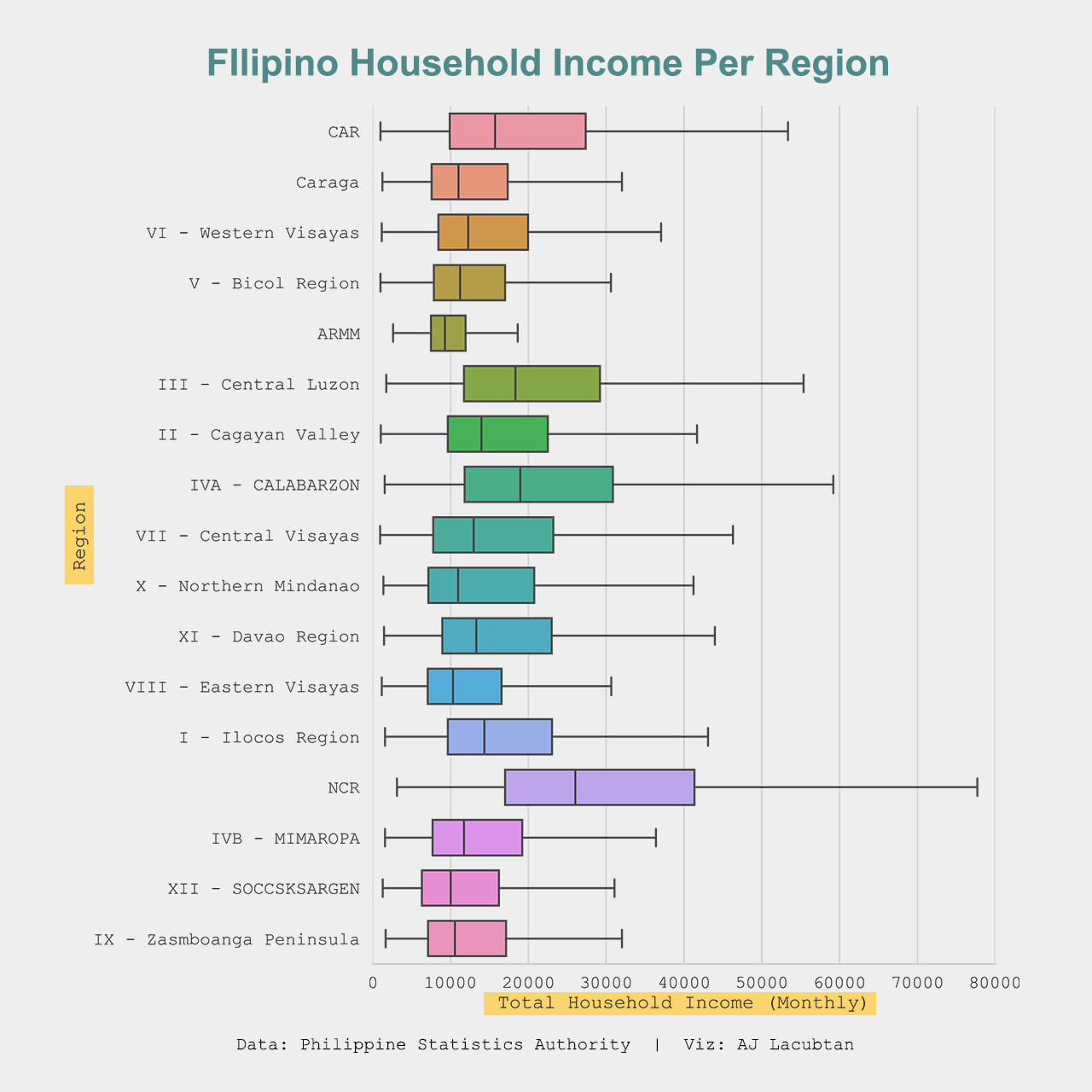
NCR and Central Luzon sit at the top of the income ladder while ARMM anchors the bottom, exposing wide regional gaps and large within-region spreads in richer areas.
Vaccination Gap
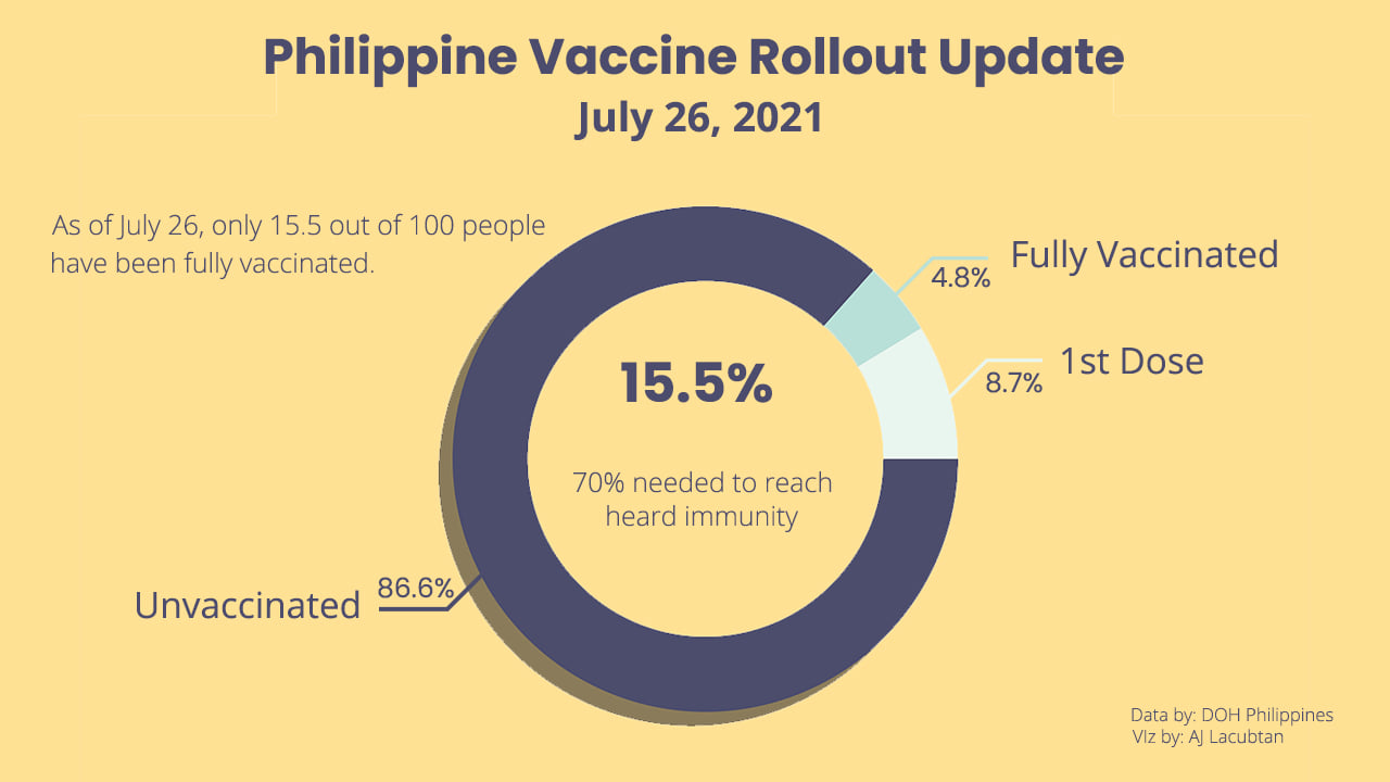
Only 15.5 % of Filipinos were fully vaccinated in mid-2021—far below the 70 % herd-immunity goal—highlighting how urgently the rollout needed to accelerate.
What Drives Boston Home Prices?
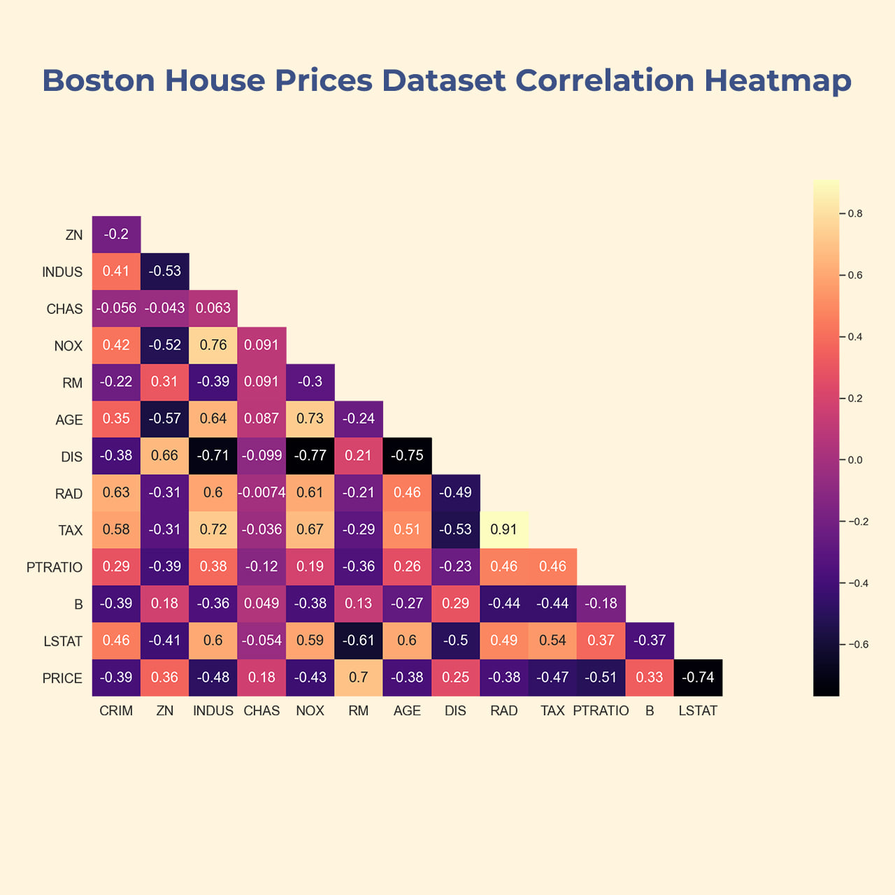
Strong TAX–RAD (0.91) and DIS–AGE (0.73) correlations flag multicollinearity risks, while the −0.74 link between PRICE and LSTAT marks socioeconomic status as a key price driver.
Seasons in a Single Glance
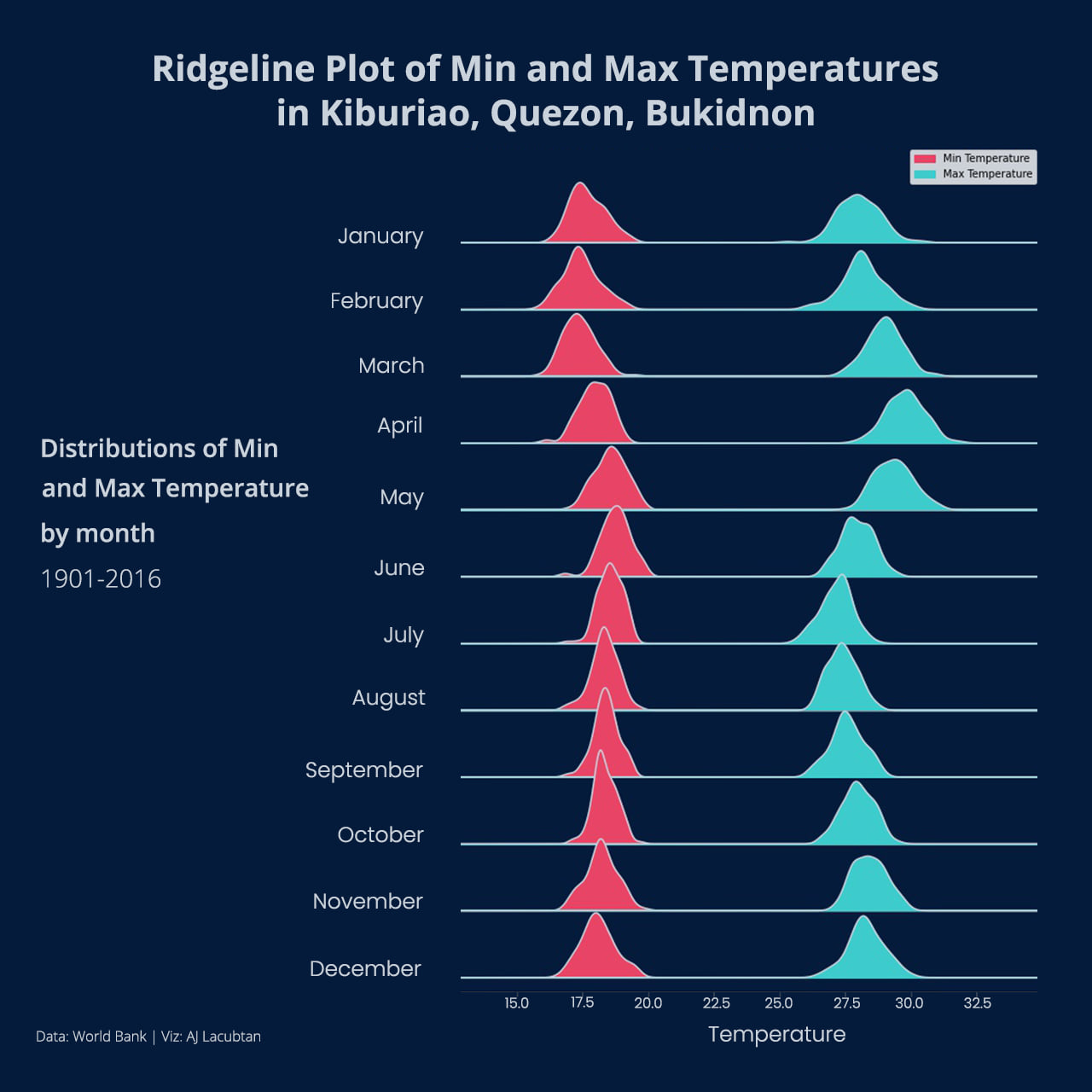
Ridgelines drift higher and broaden from April to May, turning a year of climate data into an intuitive seasonal fingerprint of Bukidnon’s warming cycle.
Farming Winners and Laggards
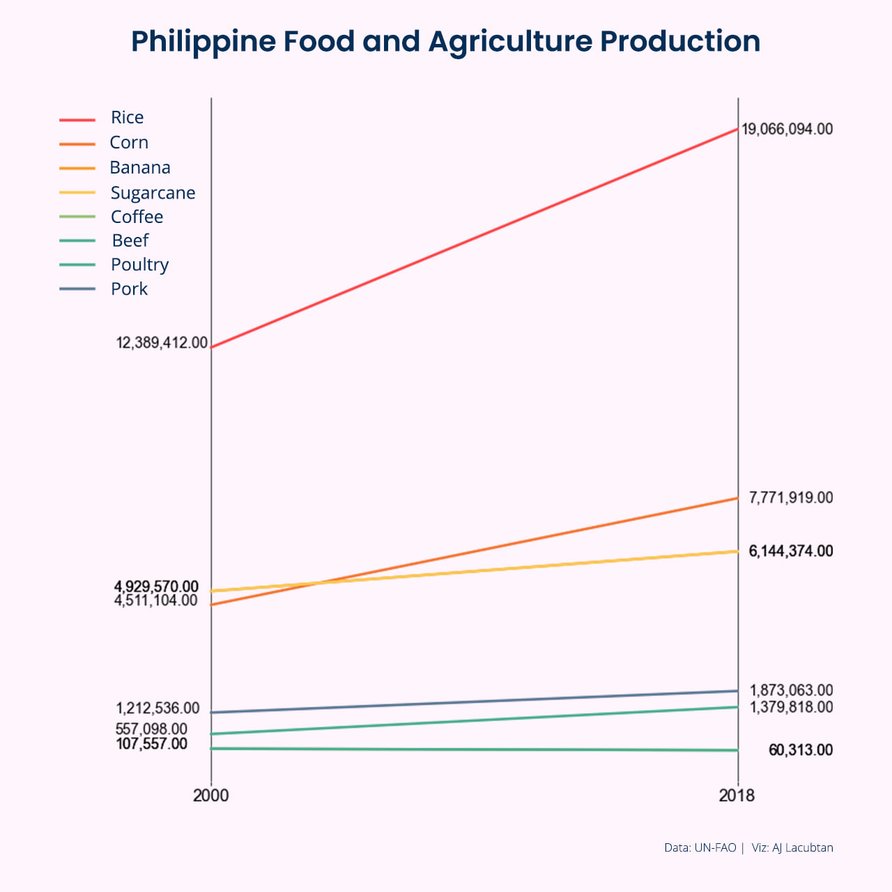
Rice’s steep climb dwarfs other staples, while coffee and beef stay flat—revealing both the strength of grain production and untapped potential in specialty crops.
Anatomy of an Athlete

Male Olympians cluster around 170 cm/70 kg, females lower and lighter, with KDE ridges underscoring gender-specific “athlete zones” that could guide talent scouting.
The Price of Ivory
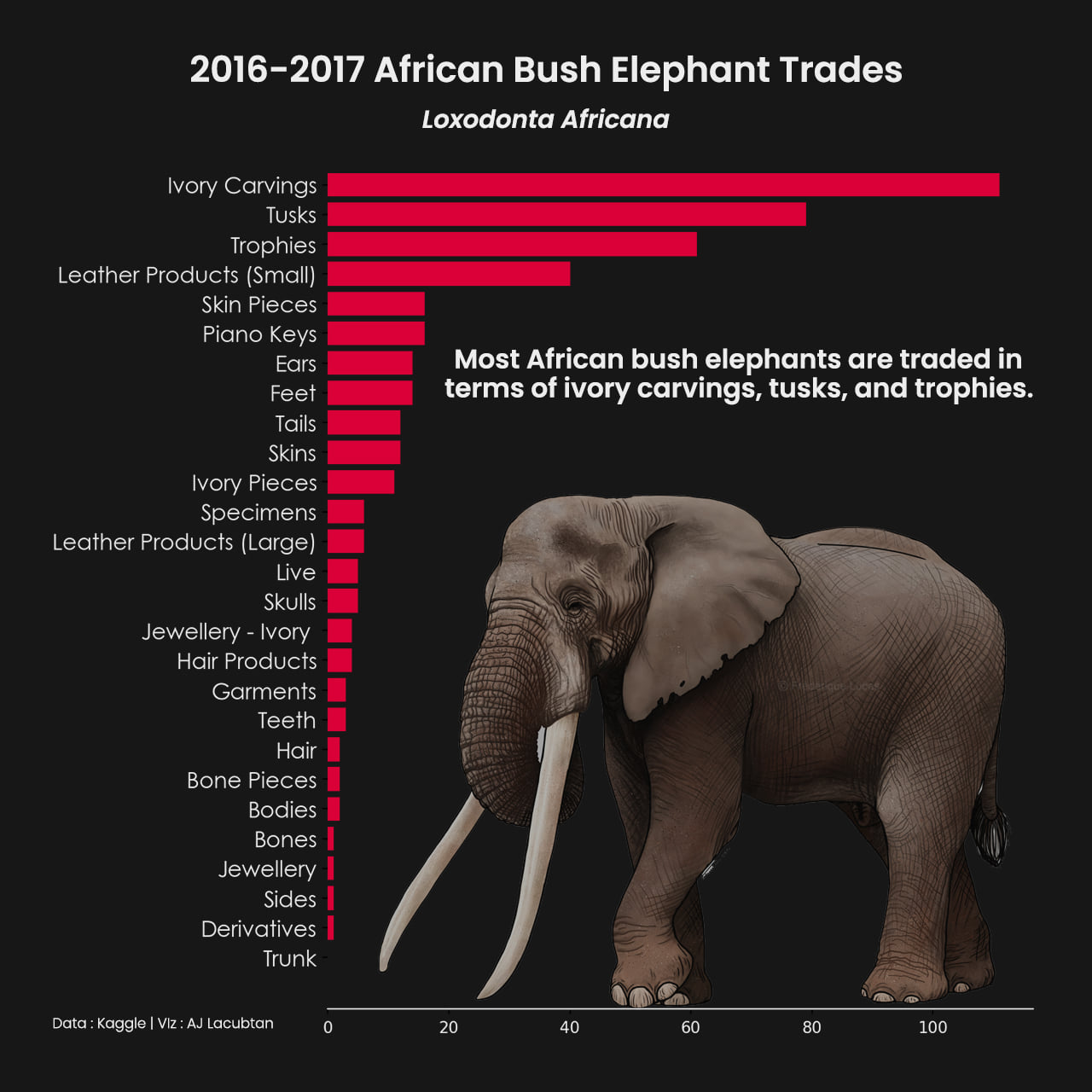
Ivory carvings, tusks, and trophies dominate the trade—an unsettling visual reminder of how consumer demand threatens an iconic species.
Youth Vote, Big Voice
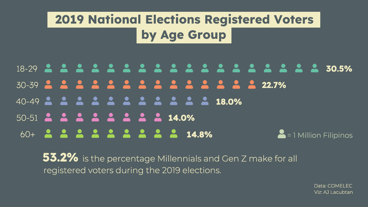
More than 53 % of registered voters are under 40, signaling a generational power shift that could reshape future Philippine elections.
Pathways to the Stars
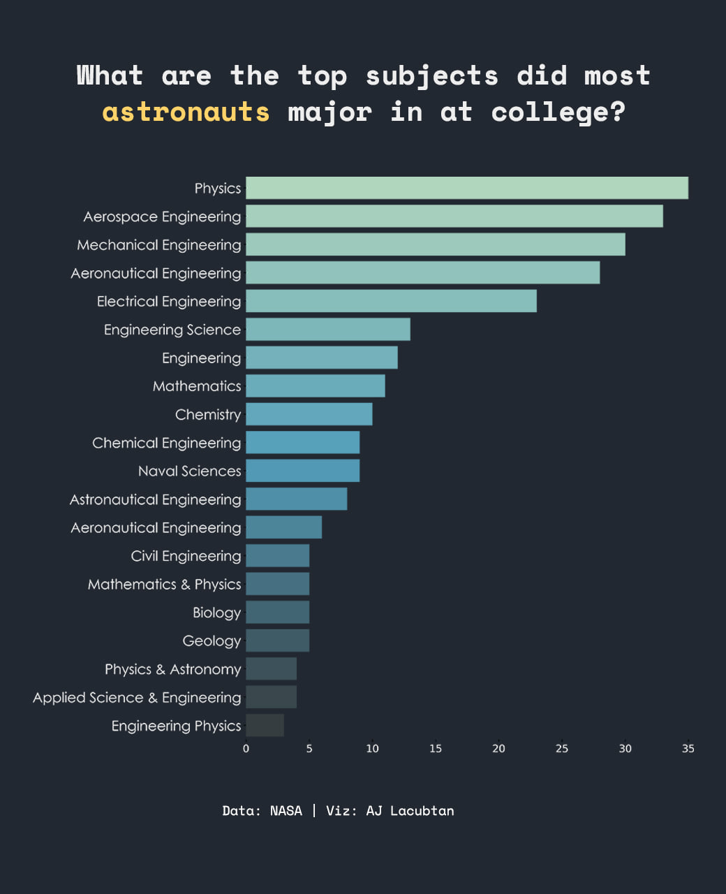
One-third of astronauts studied Physics; Aerospace and Mechanical Engineering follow closely. STEM still reigns supreme on the road to space.
Rating Magical Worlds
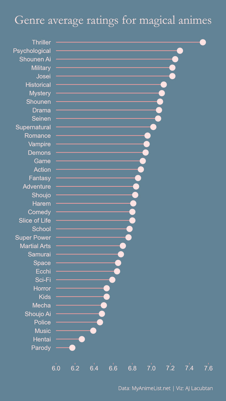
Thriller and Psychological genres top the ratings, while Parody trails—showing audiences favor darker, introspective magic over lighthearted fare.
Multivariate Health Snapshot
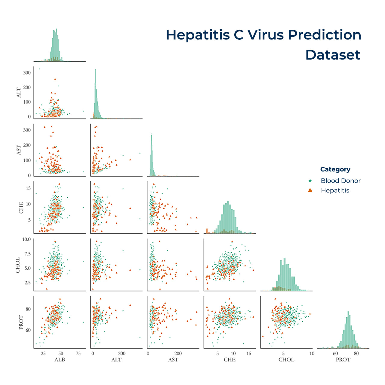 A single grid unveils how biomarkers cluster: healthy donors pack tightly around low ALT/AST, while hepatitis cases scatter higher on both axes. Diagonal histograms confirm dramatic right-skew in disease markers—clear signals for any diagnostic model.
Density, Reimagined
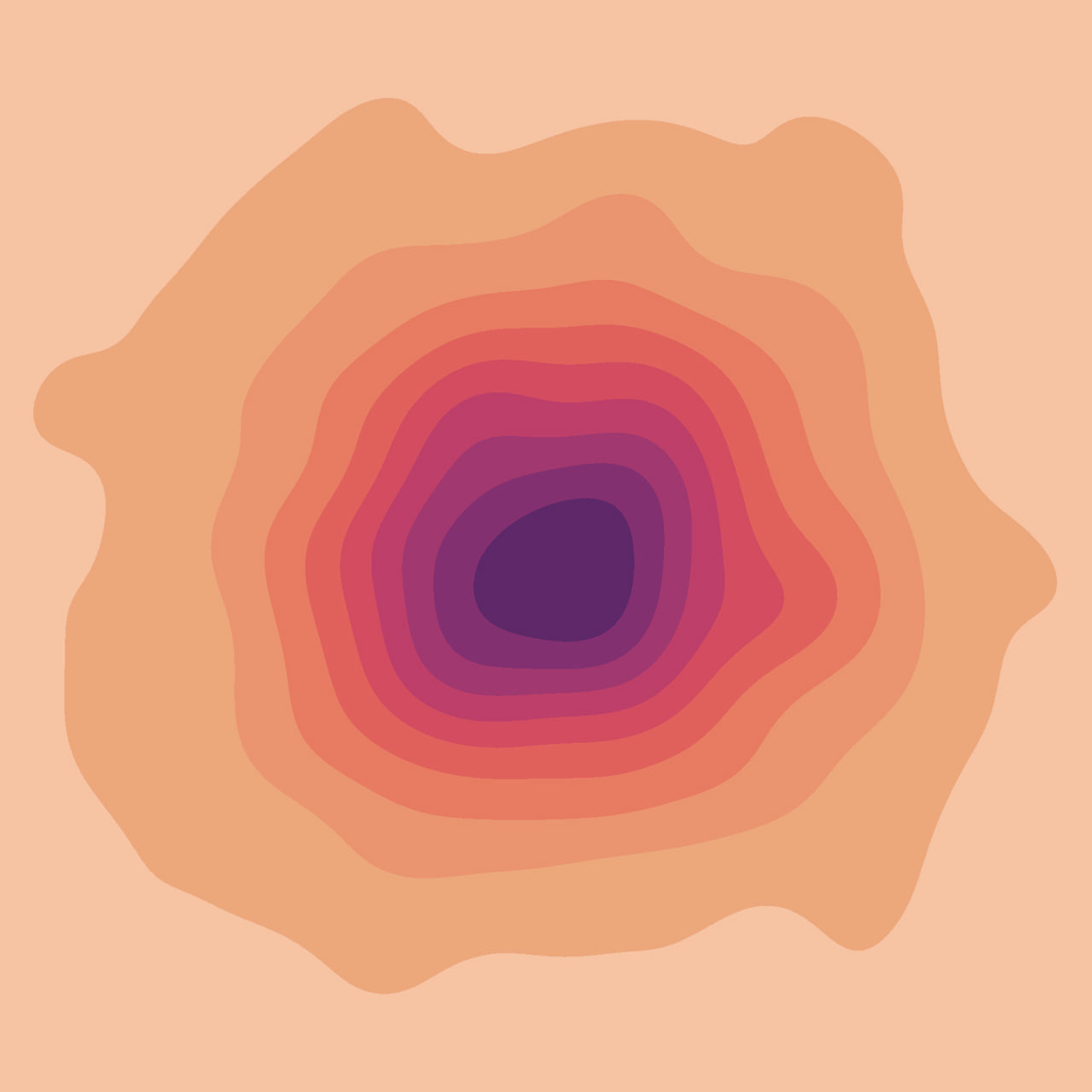
An abstract 2-D KDE turns raw coordinates into fluid contour rings—demonstrating how a statistical surface can double as minimalist art without losing its sense of central tendency and spread.
Wind Meets Temperature
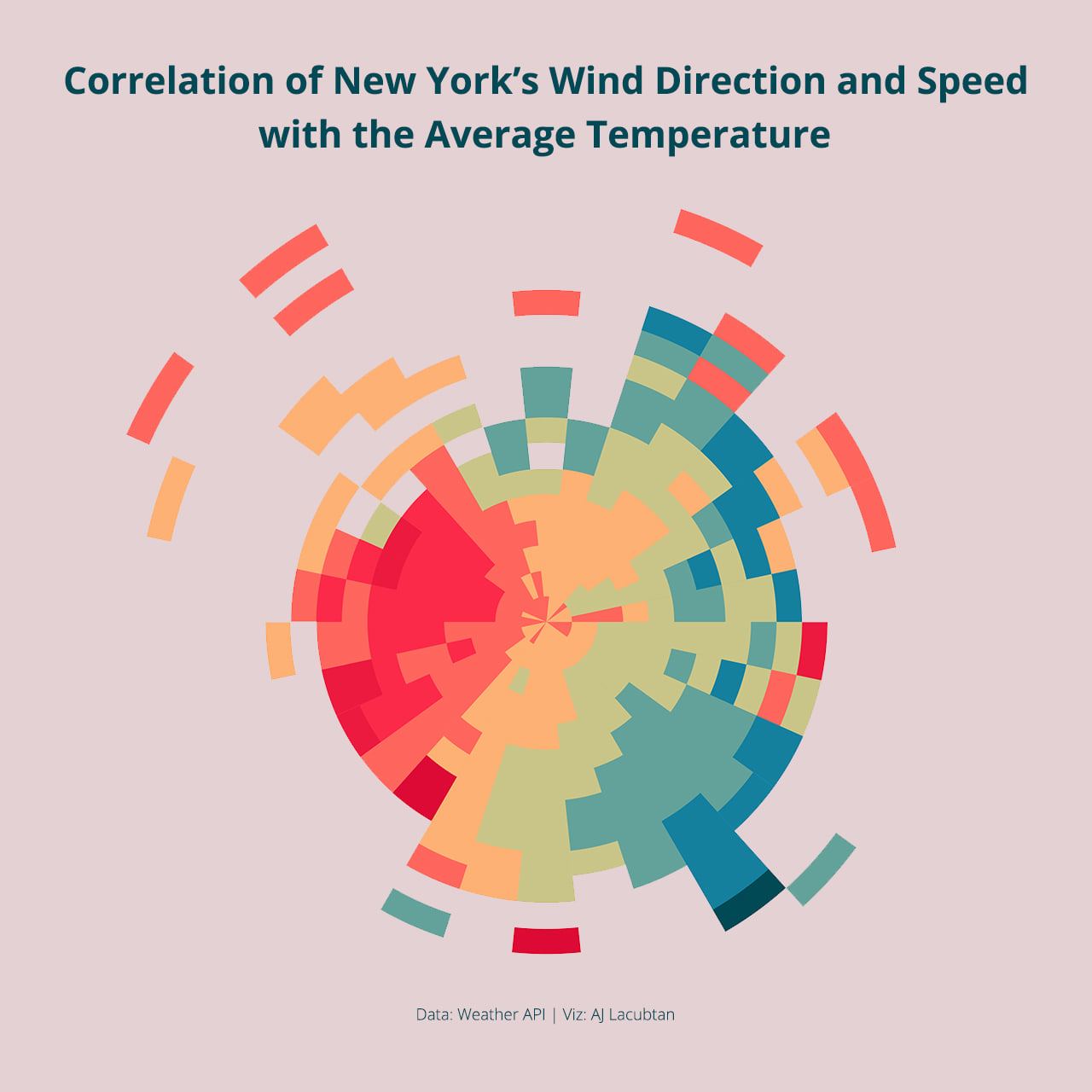
This polar heatmap maps wind direction against speed, with color encoding temperature. Warm reds concentrate in south-westerlies, while cooler teals hug north-eastern bands—linking micro-climate breezes to swings in New York’s daily temps.
Reflections and Next Steps
Creating these visualizations has reinforced my belief that good data visualization is as much about storytelling as it is about clarity and accuracy. Each chart represents an intentional effort to simplify complexity and to highlight insights that might otherwise remain hidden. By experimenting across multiple visualization techniques and datasets, I’ve deepened my skills in design thinking, statistical interpretation, and audience-focused communication.
Let’s Talk Data Stories
Have a dataset that deserves to be seen, not just analyzed?
Whether you’re looking to visualize research findings, tell a story with public data, or enhance stakeholder reports, I’d love to help turn raw numbers into compelling visuals.
Feel free to email me or explore more of my work on GitHub.